Craigslist Mobile App Design
I started this personal project during my college assignment. My main goal is wanting to make CraigsList a better user experince for all users as I felt the website is not as popular as it used to be comapared to big companies like eBay for example.
CraigsList was launched in 1995 which is 24 years ago and has no improvement of user interface since. Comparing the old internet browsing against today, there are a huge difference in terms of how people browse and use internet in the 21st century.
Role
Interaction, Visual design, Prototyping & testing
Duration
3 months
Tool
Sketch, Invision, After Effects, Photoshop
Overview
This project was to define the problem area within an everyday website or mobile app. I chose to research and redesign the mobile application for CraigsList.
Project Brief
This project explores and reimagines the functionality as well as the visual aesthetic of the popular personal advertising website’s mobile app. Through analyzing the site’s information architecture and by testing various user journeys within their application, I was able to identify a number of different pain points that the user may face.
With these challenges in mind, I designed an alternate version of the application that aims to be both intuitive, and visually pleasing than its current design.
Challenges
The redesign of CraigsList's mobile application was designed with consumers in mind. The key importance of this assignment was to app for easy navigation and usability.
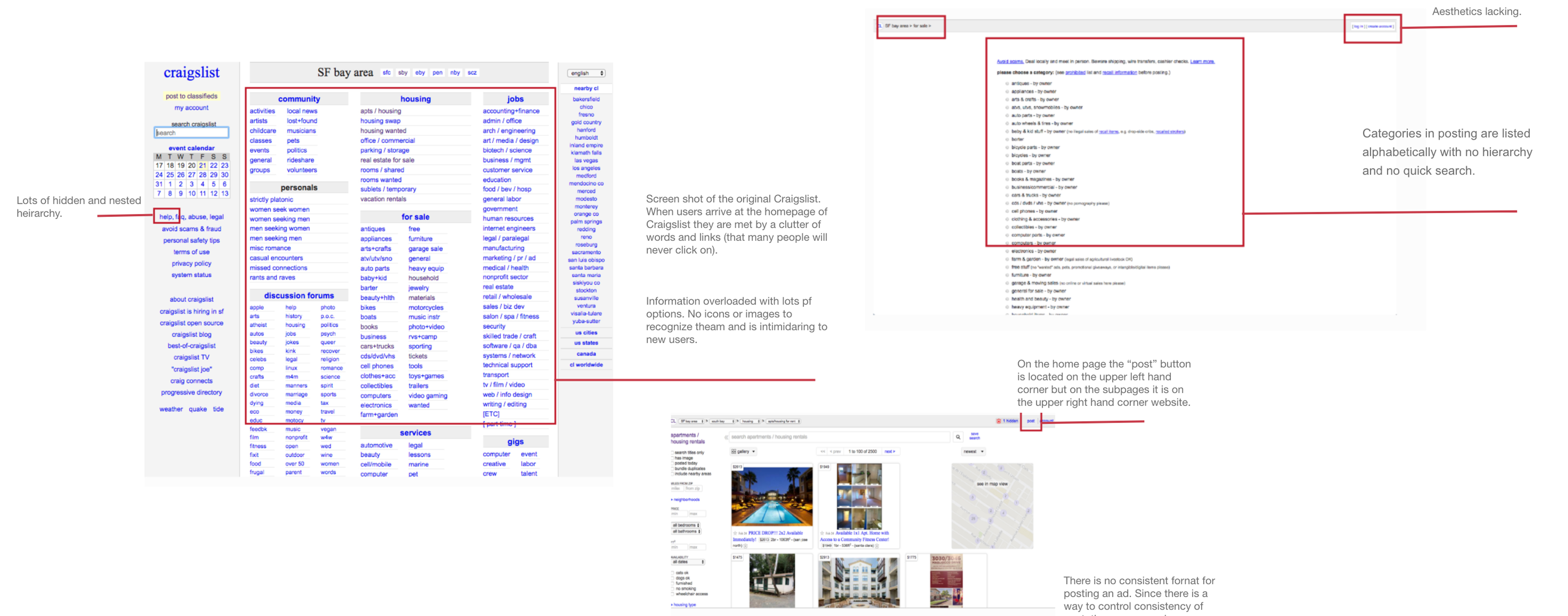
- Over the years, Craigslist has become a very popular website for classified advertisements. It is a platform to get better and cheaper stuff, but it still does not have an official mobile app.
- The website seems a bit cluttered and extremely disorganized which sometimes makes it difficult for users to use it easily.
- Craigslist has too many categories and they are very confusing. It's time-consuming to search and communicate.
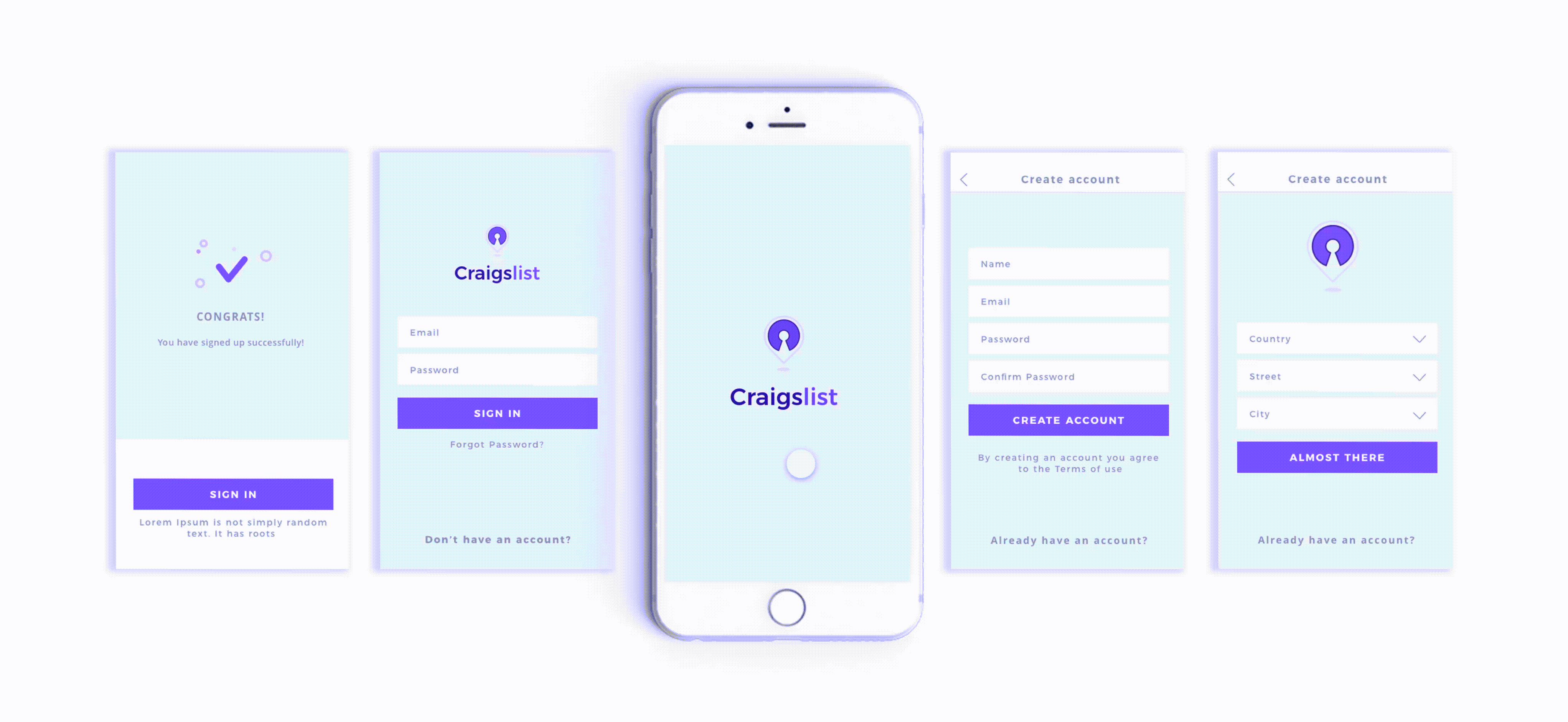
Solution
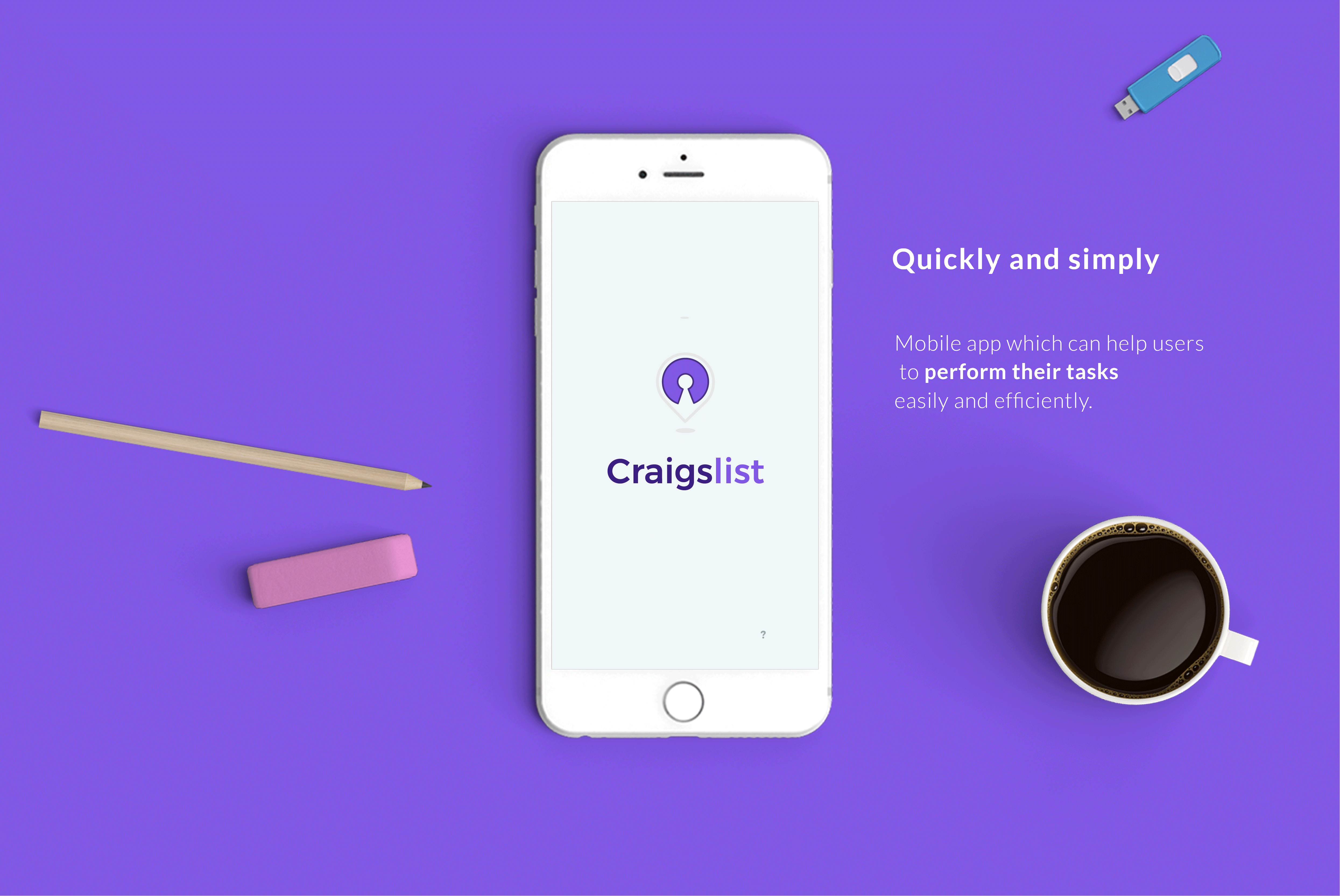
Obviously the first thing I would change is the UI elements. I want to make it more attractive and friendly for users to use. A well-designed mobile app which can help users to perform their tasks easily and efficiently.Provides organized categories to users and to incorporate everything from the website to the app. Provide the user with intuitive navigations,notifications and alerts.
Researching Product Landscape
My first step in approaching this request was to research the current product landscape. I mainly focused on 5 brands in a similar market, including Craigslist itself: Craigslist.com, CPlus, CLX, Trulia, and Airbnb. CPlus and CLX are third party apps for Craigslist. Trulia, unlike Craigslist, only focuses on rental listings. Airbnb offers services for both hosting and renting.
Takeaways from the Research
- Managing Postings
None of the current Craigslist apps (including Craigslist.com) utilizes a built-in messaging system. A smoothly integrated messages section that allows the user to manage client responses in tandem with one’s postings could really help our broker user base.
- Helping the users feel less overehelmed
The Craigslist website and apps present a lot of information to our users at once. Trulia and Airbnb demonstrate user-friendly UI that improves UX.
Current Website Observation and Insight
- My research led me to conclude that the Craigslist's Website is overwhelming and difficult to navigate.
- The main feature of the website "Post Ad" is almost invisible on the main page.
- For new users, there is no navigation menu that appears consistently throughout the website.
- The content needs to be organized in terms of structure and navigation. The design of the website lacks visual appeal.
Persona
In order to start identifying user needs, I refined the target persona for the app. I interviewed my classmates on the following:
- Demographics
- Motivations+ Goals when finding events
- Obstacles they may face in achieving their goals
- Habits + Behaviours
I then used these interviews to build out user persona for my key target audience. As well as a journey map to identify pain points I want to solve in my project.
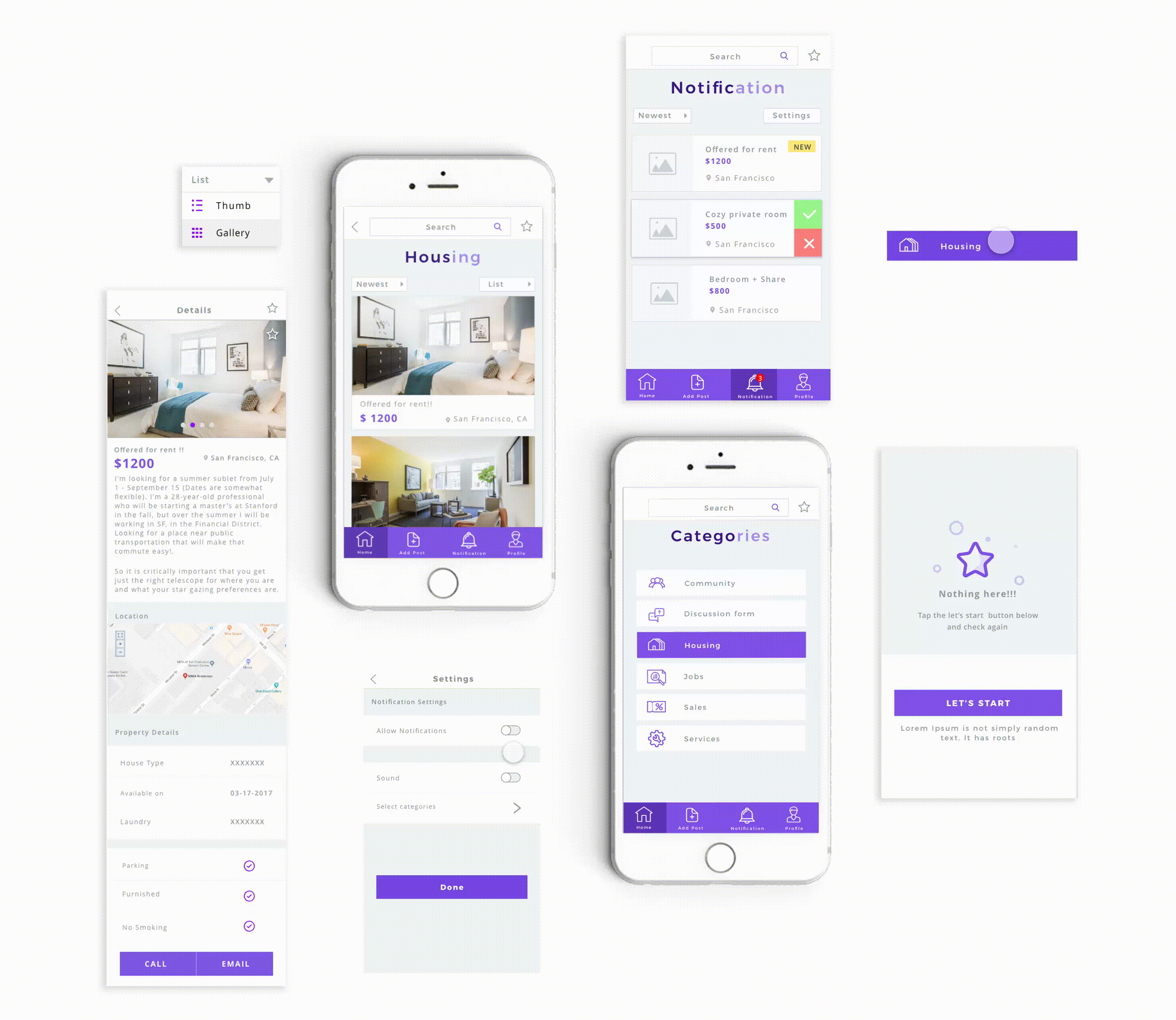
The Sketching Phase
Normally, I like to use pen and paper to brainstorm all the ideas that I have gathered from my research and then come up with multiple solutions for the problem. Once I am happy with my sketches I would make a wireframe on Figma or Sketch on how the structure would look like.
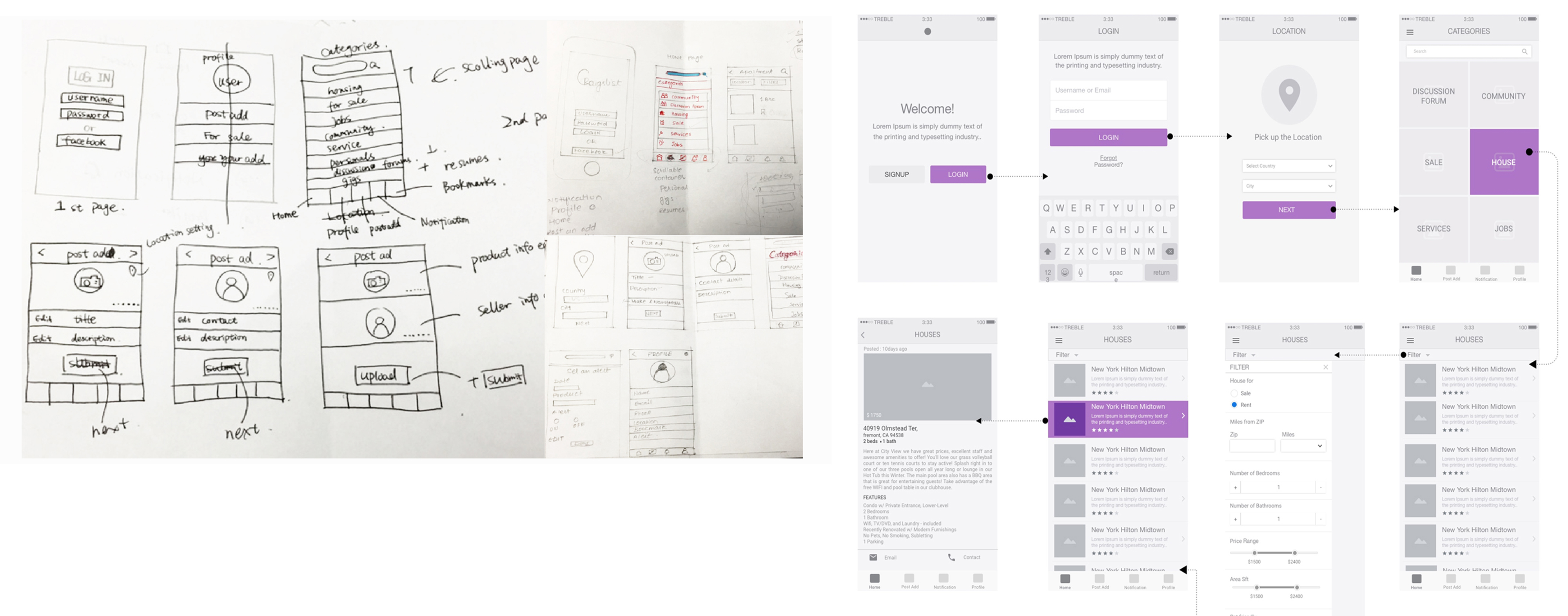
The Design Phase
If I am collaborating with other developers, designers or product managers, I would normally show them the wireframe of the product and get feedback from them and keep updating them until everyone is satisfied. But since this isnt a group project I am happy to say that I am pleased with the wireframe and I can move on with the designs.
For Design I usually use Figma or Sketch as my design tool. However I am able to use any tools that is given to me as I have already used them before. Figma stood out the most in my opinion because it works really well with both prototyping and designing.
Project Learning
This was a very interesting project to tackle as there are many things I can find to improve on the Mobile. Prototyping and User testing is a key component that I did not mention in this project . This will help UX designers figure out how users interact with the mobile.
More Work